Design System
Built a design system from scratch that unified 7 enterprise products and reduced design-to-development costs by 30%.
0
Components built
0
Products unified
0
Cost reduction
0
Company awards
01 · The Problem
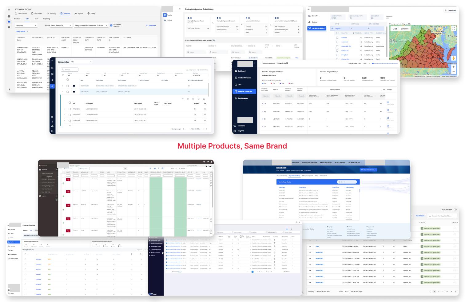
Seven products. Seven different design languages.
When I joined the company, the product suite had grown fast: seven AI-powered healthcare platforms, each built by a different team, each with its own visual logic. On the surface it looked like a cosmetic issue. But in healthcare software, where analysts, compliance officers, and clinical teams rely on consistent UI to make high-stakes decisions, inconsistency is a strategic risk.
The pain was felt across every discipline. Designers were stuck in repetitive edit cycles. Developers were rebuilding the same components, slightly differently, for every product. QA was filing UI bugs that had nothing to do with product logic.
Six different shades of "primary blue"
Three table header styles
Conflicting form validation patterns
Developers re-coding buttons per product
Designers making manual edits every sprint
No shared token system
02 · The Case for Change
Getting leadership to see it as a business problem.
The design system wasn't going to build itself, and it wasn't going to get resourced without a compelling business case. I built and presented a case to leadership that framed this not as a design team wish list, but as a cost and quality risk the company couldn't afford to ignore.
Identified the real cost
Mapped how much engineering time was being burned on repetitive UI work. Duplicated component builds. UI bugs clogging QA cycles.
Framed it as infrastructure
I positioned the design system the way engineering teams pitch a platform investment: not a project with an end date, but infrastructure that compounds in value.
Navigated shared ownership
With costs shared across product teams, I worked through stakeholder concerns diplomatically, ensuring every team saw the value.
"This wasn't a design team project. It was a company-wide infrastructure investment, and I had to make everyone believe that before a single component was built."
03 · The Architecture
Built in layers. Token-first. Naming-consistent.
The system wasn't just a Figma library. It was a two-sided ecosystem. On the design side: a structured token and component system in Figma. On the engineering side: a custom developer doc app with copy-ready code. The key was that token names and component names were identical on both sides.
Design Tokens
Color, typography, spacing, border radius, shadow. The atomic values everything else inherits from.
Primitives
Raw atoms: color swatches, type scales, icon set, grid system.
Components
70+ reusable UI components built on primitives. Buttons, tables, forms, alerts, modals.
Patterns
Interaction patterns, page templates, and complex data display patterns for healthcare workflows.
Product UIs
NetworkIQ, ContractsAI, PCMS, SurgeAI—each built on the system.
The Figma to Dev Bridge
One of the core decisions was building a developer doc app alongside Figma: a custom internal tool where devs could see every component with copy-ready code. The critical rule: component names and token names had to be identical in both systems. This single decision eliminated an entire category of handoff errors.
04 · The Work
70+ components. Built for healthcare complexity.
Every component was designed for the reality of healthcare data: dense tables, status-critical alerts, complex forms, multi-step workflows.
Screen 01
Component Overview
Form Inputs & Validation
Standardized patterns reduced user anxiety on sensitive data entry.
Status Badges
Accessible color system for status indicators, designed with strict WCAG contrast ratios.
Button System
Three-tier hierarchy covering every interaction type. Primary, secondary, destructive.
Screen 02
Smart Data Table
The most complex and most used component in the system. In-cell editing, sorting, filtering, compliance tagging, expandable rows, and pagination—all standardized. Before the system, each team had a different table. After: one component, seven products, zero UI bugs.
In-Cell Editing & Sorting
Full interaction suite built into a single component.
Compliance Tagging
Status columns with accessible color coding built directly into the component.
Expandable Rows
Complex data structures handled within the same component.
05 · Leadership & Process
Culture first. Components second.
I grew the design team from one to five specifically to make this possible. But before we touched Figma, I had to create the conditions for collaboration: shared principles, shared language, and shared ownership of the system.
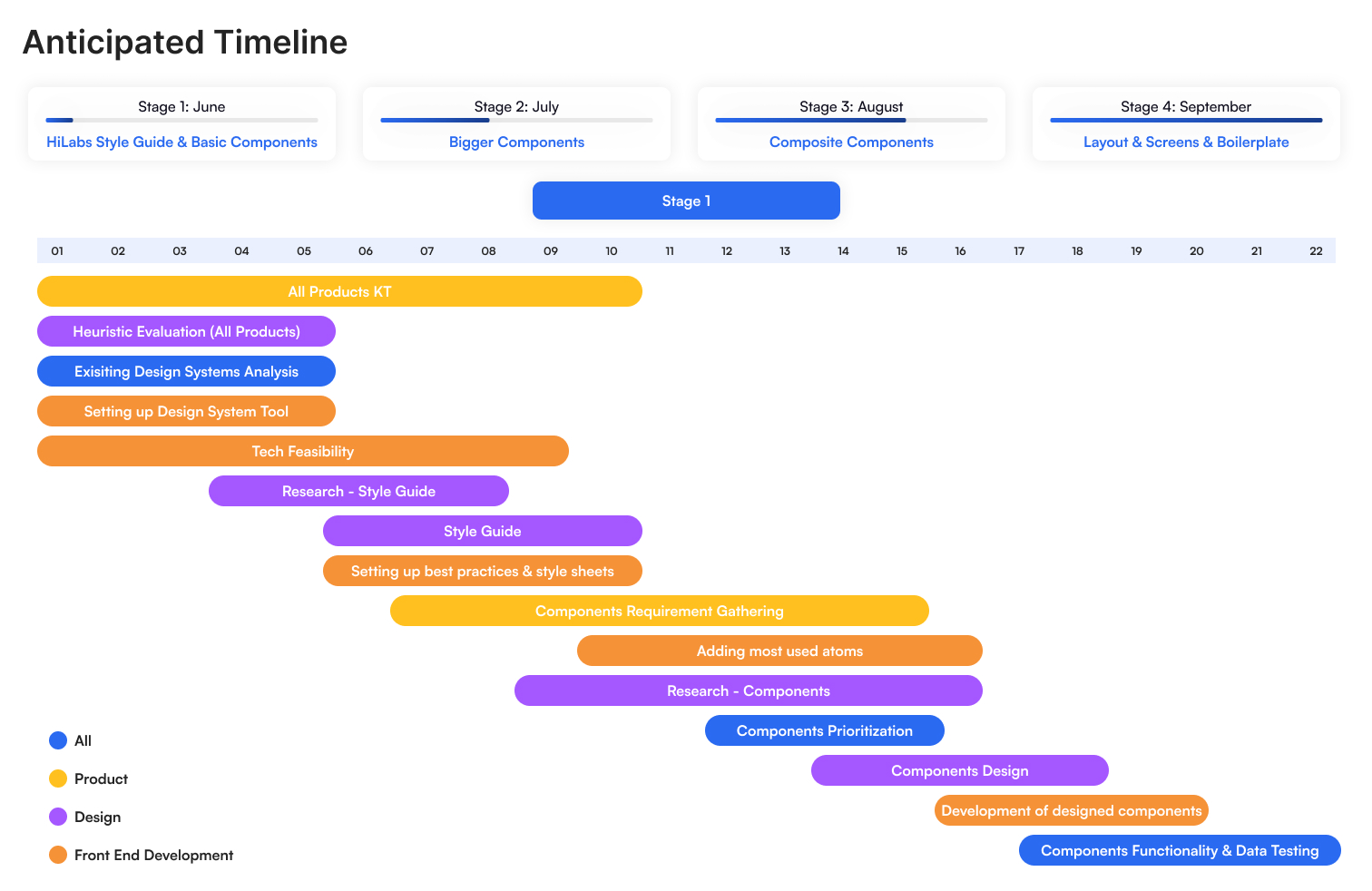
Discover
Cross-functional workshops, full UI audit
Define
Token architecture, naming conventions
Build
70+ components in Figma + dev doc app
Adopt
Live pairing, office hours, roadshows
Evolve
Backlog grooming, component requests
How adoption happened
We didn't mandate adoption. We made it irresistible. Live pairing sessions with engineers. Office hours for designers on tricky edge cases. Internal roadshows showing how fast new features could be prototyped. The strategy was deliberate: start with one product, prove the value visibly, let other teams ask to be next.
06 · Adoption
One product at a time. Intentionally.
Incremental adoption wasn't a constraint. It was the strategy. Proving value in one product created internal demand. Teams started asking to be onboarded, rather than being told to comply.
ContractsAI
0
SurgeAI
0
Roster Automation
0
PCMS
0
Clinical
0
Network IQ
0
MCheck Provider
0
Live Pairing Sessions
Sat with engineers to drop in components together.
Design Office Hours
Quick sessions for help applying system patterns.
Internal Roadshows
Live demos showing how fast new features could be prototyped.
Living Backlog
Product teams could submit component requests.
07 · Impact
The numbers. And the ones that matter most.
0
UI design & dev cost reduction
0
Reusable components
0
UI component bugs in QA
0
Products unified
December 2024
Idea Factory Award
Recognised for implementing an enterprise-wide design system that streamlined product development by 30%.
08 · Reflection
What I learned building this.
The system worked. But in hindsight, I'd instrument adoption earlier. We had qualitative signals—teams asking to join, QA bugs dropping—but formal adoption tracking came later than it should have. Earlier metrics would have made stakeholder conversations easier and faster.
Four lessons
Design systems are infrastructure, not deliverables.
The moment you treat it like a project with an end date, it dies. It needs a product mindset: a backlog, an owner, and a roadmap.
Adoption is a people problem, not a design problem.
The best component library in the world fails without trust, visibility, and genuine collaboration.
Naming is everything.
Consistent token and component naming across design and code was the single highest-leverage decision we made.
Start where the pain is loudest.
We chose the first product for adoption strategically: highest visibility, highest pain. The success was undeniable.