This Portfolio
A SaaS product. The product is me.
0
Versions built
0
Designer, PM, builder
0
Templates used
0
Deployed and public
01 · The Brief
I build dashboards for a living. My portfolio should be one.
I have never seen another designer do this. Not in the portfolios I have reviewed, not in the ones I have been sent as references. Everyone builds a website. I build operational software. The gap between those two things felt like the most honest thing I could say about my work.
The idea came to me while I was building the Framer version. I was halfway through a perfectly fine scrolling website when I stopped and asked myself what I was actually trying to communicate. The answer was not "here are some projects." It was "this is how I think, this is what I ship, and I built this end to end with no handoff."
That became the brief. A dashboard. A real one. Me as the product.
"I have never seen another designer do this. That was reason enough."
02 · Three Versions
The first one taught me what I was actually trying to build.
This project went through 0 versions of the same idea.
Version one was Framer. I had never used Framer before. I taught myself as I went, which is fine until you try to build a dashboard in a tool designed for websites. The responsiveness alone was enough to make me want to close the laptop permanently. Framer is brilliant for what it is. What I was trying to build was not that.
I could not let go of the idea though. It resonated in a way that generic portfolio ideas do not. So I stopped, sat with what was not working, and came back to it properly.
Version two started on paper. Or rather, on my iPad. I approached it the way I approach client work: proper brief, clear definitions of who would read this and what they needed to walk away knowing, wireframes before any tool was opened. I also wrote detailed specification documents covering the design system, component behaviour, colour tokens, image folders, and interaction logic. This was not me being thorough for the sake of it. It was me making sure that whatever I put into a build tool came out exactly as intended.
I invested significantly in credits on one AI build tool and the experience was frustrating. Credits disappearing on unnecessary operations, inconsistent output, a workflow that felt expensive and unpredictable. A developer friend pointed me toward a different tool with a slight learning curve but far more control. I switched. The difference was immediate.
Version three is what you are looking at now.
03 · The Build
I did not know what a commit was 0 months ago.
Looking at code was intimidating. Not slightly unfamiliar. Genuinely intimidating. I would open a file, see the structure, and close it. Git was something developers talked about. Vercel was a word I had seen in job descriptions. Environment variables might as well have been a different language.
The specification documents I had written for version two turned out to be the right foundation. They were precise enough that the build tool could execute them accurately. Ambiguous instructions produced approximately right results. Precise ones produced exactly right ones. That feedback loop is faster and more honest than most design reviews I have been in.
The stack ended up being a proper one. Version control, a real deployment pipeline, a live database for the interactive features on the profile page. Visitors vote on what I should do next. The numbers are real. The leaderboard updates in real time. It required understanding how a database works, what an environment variable is, and why you do not push credentials to a public repository.
Six months ago that sentence would have made no sense to me. Now it is just Tuesday.
04 · The Design Decisions
Every choice was an argument.
Decision 1
Dashboard over website
A scrolling site with project cards says "here is my work." A dashboard says "this is how I think when the stakes are real." I design dense, operational software. The portfolio should feel like it.
Decision 2
Live data over static numbers
The profile page connects to a real database. Reactions, votes, suggestions, all of it persists. A visitor who leaves their mark on the checklist will see it there the next time they visit. Static numbers on a portfolio page are decorative. These are not.
Decision 3
No template, no UI kit
Every component was designed first and built to that design. The KPI cards, the timeline, the Design DNA heatmap, the philosophy card stack on the profile page. All of it specified, then built. None of it borrowed.
Decision 4
Personality alongside craft
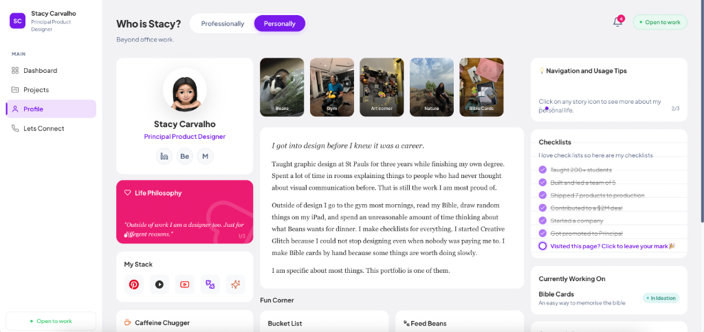
The profile page exists because a hiring manager reading five case studies in a row deserves to know who they are actually considering. Beans the guinea pig, the Bible cards made by hand, the voting section. It is the same rigour applied to a different brief.
05 · Reflection
What three versions of the same idea actually teaches you.
The thing that surprised me most was how much the tool matters less than the specification. I spent money on a tool that did not work well and made good progress anyway because the brief was clear. I switched to a better tool and the difference was not magic, it was consistency.
The fear of development tools turned out to be mostly unfamiliarity. Every tool in this stack felt inaccessible when I started. Git has documentation. Vercel has error messages. Databases have schemas. They all respond to clear thinking the same way Figma does. You just have to be willing to read the error.
The portfolio is live. It is not finished. Those are different things and I have learned to be comfortable with both.
Four things worth saying out loud:
Specification quality determines output quality. Always.
Fear of tools is just unfamiliarity wearing a costume.
Three versions of something is not failure. It is how you find the right answer.
Ship it. A live product with rough edges beats a perfect one that stays on your hard drive.